I’ve been keeping a book of patterns lately. They seem so, well, delightful after all the p
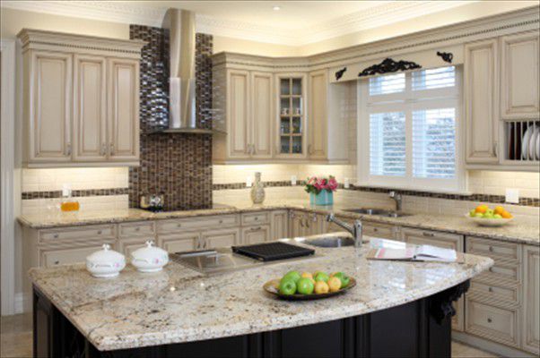
This tile design, “Cambridge,” is from Stone Impressions. It has the look of engraving, with fine lines & shading.
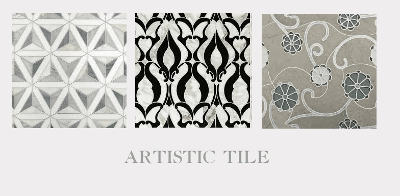 Artistic Tile has great tile patterns, precision cut, with glass, stone, ceramic, and mirror all mixed together.
 And I’ve always loved Walker-Zanger’s La Fleur Pattern. There’s something about light-colored flowers on a black field that feels both unexpected and perfect.
So I wonder, which of these are going to become the OMG patterns of the 2030’s, the “I can’t believe someone actually liked that and paid to install it” patterns?
I grew up in LA in the 1970s and I can still remember some of the kitchen floor tiles in our neighborhood.
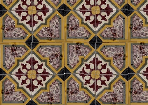 They were crazy and happy and sometimes they just skipped the tile altogether and went straight to linoleum.

Of course, as teenagers, we knew so much more than everyone else. So we knew that we would never make the same mistake in our homes.
The funny thing, is that these don’t look so bad to me anymore. Even the green/gold lino pattern has a certain exuberance that is kind of appealing.
Let’s get together in a couple of years, and see what we’re all thinking then.
lain fabrics and tone-on-tone design we’ve done in the last decade.